在本章中,我們將學習如何使用 Bootstrap 創建表單。Bootstrap 通過一些簡單的 HTML 標記和擴展的類即可創建出不同樣式的表單。
表單布局
Bootstrap 提供了下列類型的表單布局:
- 垂直表單(默認)
- 內聯表單
- 水平表單
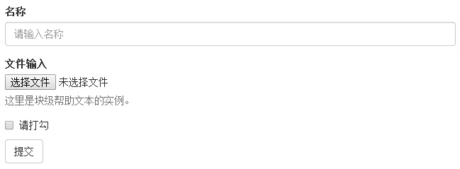
垂直或基本表單
基本的表單結構是 Bootstrap 自帶的,個別的表單控件自動接收一些全局樣式。下面列出了創建基本表單的步驟:
- 向父 <form> 元素添加 role="form"。
- 把標簽和控件放在一個帶有 class .form-group 的 <div> 中。這是獲取最佳間距所必需的。
- 向所有的文本元素 <input>、<textarea> 和 <select> 添加 class .form-control。
<!DOCTYPE html>
<html>
<head>
   <title>Bootstrap 實例 - 基本表單</title>
   <link href="/bootstrap/css/bootstrap.min.css" rel="stylesheet">
   <script src="/scripts/jquery.min.js"></script>
   <script src="/bootstrap/js/bootstrap.min.js"></script>
</head>
<body>

<form role="form">
   <div class="form-group">
      <label for="name">名稱</label>
      <input type="text" class="form-control" id="name"
         placeholder="請輸入名稱">
   </div>
   <div class="form-group">
      <label for="inputfile">文件輸入</label>
      <input type="file" id="inputfile">
      <p class="help-block">這里是塊級幫助文本的實例。</p>
   </div>
   <div class="checkbox">
      <label>
      <input type="checkbox"> 請打勾
      </label>
   </div>
   <button type="submit" class="btn btn-default">提交</button>
</form>

</body>
</html>
結果如下所示:
內聯表單
如果需要創建一個表單,它的所有元素是內聯的,向左對齊的,標簽是并排的,請向 <form> 標簽添加 class .form-inline。
<!DOCTYPE html>
<html>
<head>
   <title>Bootstrap 實例 - 內聯表單</title>
   <link href="/bootstrap/css/bootstrap.min.css" rel="stylesheet">
   <script src="/scripts/jquery.min.js"></script>
   <script src="/bootstrap/js/bootstrap.min.js"></script>
</head>
<body>

<form class="form-inline" role="form">
   <div class="form-group">
      <label class="sr-only" for="name">名稱</label>
      <input type="text" class="form-control" id="name"
         placeholder="請輸入名稱">
   </div>
   <div class="form-group">
      <label class="sr-only" for="inputfile">文件輸入</label>
      <input type="file" id="inputfile">
   </div>
   <div class="checkbox">
      <label>
      <input type="checkbox"> 請打勾
      </label>
   </div>
   <button type="submit" class="btn btn-default">提交</button>
</form>

</body>
</html>
結果如下所示:

- 默認情況下,Bootstrap 中的 input、select 和 textarea 有 100% 寬度。在使用內聯表單時,您需要在表單控件上設置一個寬度。
- 使用 class .sr-only,您可以隱藏內聯表單的標簽。
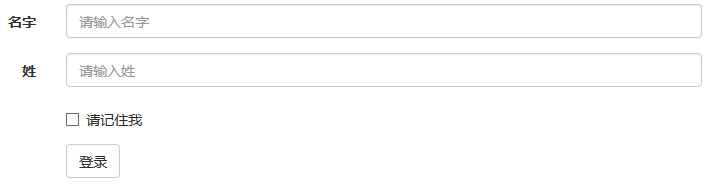
水平表單
水平表單與其他表單不僅標記的數量上不同,而且表單的呈現形式也不同。如需創建一個水平布局的表單,請按下面的幾個步驟進行:
- 向父 <form> 元素添加 class .form-horizontal。
- 把標簽和控件放在一個帶有 class .form-group 的 <div> 中。
- 向標簽添加 class .control-label。
<!DOCTYPE html>
<html>
<head>
   <title>Bootstrap 實例 - 水平表單</title>
   <link href="/bootstrap/css/bootstrap.min.css" rel="stylesheet">
   <script src="/scripts/jquery.min.js"></script>
   <script src="/bootstrap/js/bootstrap.min.js"></script>
</head>
<body>

<form class="form-horizontal" role="form">
   <div class="form-group">
      <label for="firstname" class="col-sm-2 control-label">名字</label>
      <div class="col-sm-10">
         <input type="text" class="form-control" id="firstname"
            placeholder="請輸入名字">
      </div>
   </div>
   <div class="form-group">
      <label for="lastname" class="col-sm-2 control-label">姓</label>
      <div class="col-sm-10">
         <input type="text" class="form-control" id="lastname"
            placeholder="請輸入姓">
      </div>
   </div>
   <div class="form-group">
      <div class="col-sm-offset-2 col-sm-10">
         <div class="checkbox">
            <label>
               <input type="checkbox"> 請記住我
            </label>
         </div>
      </div>
   </div>
   <div class="form-group">
      <div class="col-sm-offset-2 col-sm-10">
         <button type="submit" class="btn btn-default">登錄</button>
      </div>
   </div>
</form>

</body>
</html>
結果如下所示:
支持的表單控件
Bootstrap 支持最常見的表單控件,主要是 input、textarea、checkbox、radio 和 select。
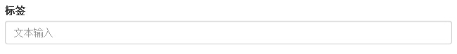
輸入框(Input)
最常見的表單文本字段是輸入框 input。用戶可以在其中輸入大多數必要的表單數據。Bootstrap 提供了對所有原生的 HTML5 的 input 類型的支持,包括:text、password、datetime、datetime-local、date、month、time、week、number、email、url、search、tel 和 color。適當的 type 聲明是必需的,這樣才能讓 input 獲得完整的樣式。
<!DOCTYPE html>
<html>
<head>
   <title>Bootstrap 實例 - 輸入框</title>
   <link href="/bootstrap/css/bootstrap.min.css" rel="stylesheet">
   <script src="/scripts/jquery.min.js"></script>
   <script src="/bootstrap/js/bootstrap.min.js"></script>
</head>
<body>

<form role="form">
  <div class="form-group">
    <label for="name">標簽</label>
    <input type="text" class="form-control" placeholder="文本輸入">
  </div>
 </form>

</body>
</html>
結果如下所示:
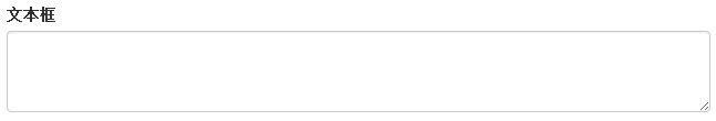
文本框(Textarea)
當您需要進行多行輸入的時,則可以使用文本框 textarea。必要時可以改變 rows 屬性(較少的行 = 較小的盒子,較多的行 = 較大的盒子)。
<!DOCTYPE html>
<html>
<head>
   <title>Bootstrap 實例 - 文本框</title>
   <link href="/bootstrap/css/bootstrap.min.css" rel="stylesheet">
   <script src="/scripts/jquery.min.js"></script>
   <script src="/bootstrap/js/bootstrap.min.js"></script>
</head>
<body>

<form role="form">
  <div class="form-group">
    <label for="name">文本框</label>
    <textarea class="form-control" rows="3"></textarea>
  </div>
</form>

</body>
</html>
結果如下所示:
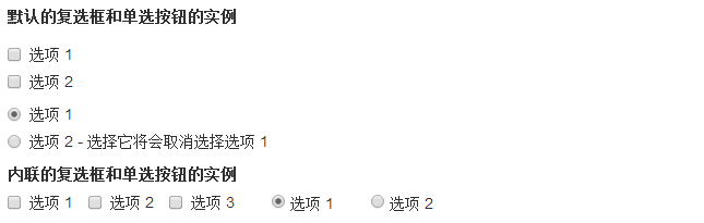
復選框(CheckBoxe)和單選框(Radio)
復選框和單選按鈕用于讓用戶從一系列預設置的選項中進行選擇。
- 當創建表單時,如果您想讓用戶從列表中選擇若干個選項時,請使用 checkbox。如果您限制用戶只能選擇一個選項,請使用 radio。
- 對一系列復選框和單選框使用 .checkbox-inline 或 .radio-inline class,控制它們顯示在同一行上。
下面的實例演示了這兩種類型(默認和內聯):
<!DOCTYPE html>
<html>
<head>
   <title>Bootstrap 實例 - 復選框和單選按鈕</title>
   <link href="/bootstrap/css/bootstrap.min.css" rel="stylesheet">
   <script src="/scripts/jquery.min.js"></script>
   <script src="/bootstrap/js/bootstrap.min.js"></script>
</head>
<body>

<label for="name">默認的復選框和單選按鈕的實例</label>
<div class="checkbox">
   <label><input type="checkbox" value="">選項 1</label>
</div>
<div class="checkbox">
   <label><input type="checkbox" value="">選項 2</label>
</div>

<div class="radio">
   <label>
      <input type="radio" name="optionsRadios" id="optionsRadios1"
         value="option1" checked> 選項 1
   </label>
</div>
<div class="radio">
   <label>
      <input type="radio" name="optionsRadios" id="optionsRadios2"
         value="option2">
         選項 2 - 選擇它將會取消選擇選項 1
   </label>
</div>
<label for="name">內聯的復選框和單選按鈕的實例</label>
<div>
   <label class="checkbox-inline">
      <input type="checkbox" id="inlineCheckbox1" value="option1"> 選項 1
   </label>
   <label class="checkbox-inline">
      <input type="checkbox" id="inlineCheckbox2" value="option2"> 選項 2
   </label>
   <label class="checkbox-inline">
      <input type="checkbox" id="inlineCheckbox3" value="option3"> 選項 3
   </label>
   <label class="checkbox-inline">
      <input type="radio" name="optionsRadiosinline" id="optionsRadios3"
         value="option1" checked> 選項 1
   </label>
   <label class="checkbox-inline">
      <input type="radio" name="optionsRadiosinline" id="optionsRadios4"
         value="option2"> 選項 2
   </label>
</div>

</body>
</html>
結果如下所示:
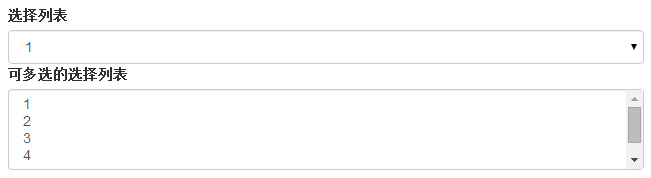
選擇框(Select)
當您想讓用戶從多個選項中進行選擇,但是默認情況下只能選擇一個選項時,則使用選擇框。
- 使用 <select> 展示列表選項,通常是那些用戶很熟悉的選擇列表,比如州或者數字。
- 使用 multiple="multiple" 允許用戶選擇多個選項。
下面的實例演示了這兩種類型(select 和 multiple):
<!DOCTYPE html>
<html>
<head>
   <title>Bootstrap 實例 - 選擇框</title>
   <link href="/bootstrap/css/bootstrap.min.css" rel="stylesheet">
   <script src="/scripts/jquery.min.js"></script>
   <script src="/bootstrap/js/bootstrap.min.js"></script>
</head>
<body>

<form role="form">
   <div class="form-group">
      <label for="name">選擇列表</label>
      <select class="form-control">
         <option>1</option>
         <option>2</option>
         <option>3</option>
         <option>4</option>
         <option>5</option>
      </select>

      <label for="name">可多選的選擇列表</label>
      <select multiple class="form-control">
         <option>1</option>
         <option>2</option>
         <option>3</option>
         <option>4</option>
         <option>5</option>
      </select>
   </div>
</form>

</body>
</html>
結果如下所示:
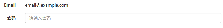
靜態控件
當您需要在一個水平表單內的表單標簽后放置純文本時,請在 <p> 上使用 class .form-control-static。
<!DOCTYPE html>
<html>
<head>
   <title>Bootstrap 實例 - 靜態控件</title>
   <link href="/bootstrap/css/bootstrap.min.css" rel="stylesheet">
   <script src="/scripts/jquery.min.js"></script>
   <script src="/bootstrap/js/bootstrap.min.js"></script>
</head>
<body>

<form class="form-horizontal" role="form">
  <div class="form-group">
    <label class="col-sm-2 control-label">Email</label>
    <div class="col-sm-10">
      <p class="form-control-static">email@example.com</p>
    </div>
  </div>
  <div class="form-group">
    <label for="inputPassword" class="col-sm-2 control-label">密碼</label>
    <div class="col-sm-10">
      <input type="password" class="form-control" id="inputPassword"
         placeholder="請輸入密碼">
    </div>
  </div>
</form>

</body>
</html>
結果如下所示:
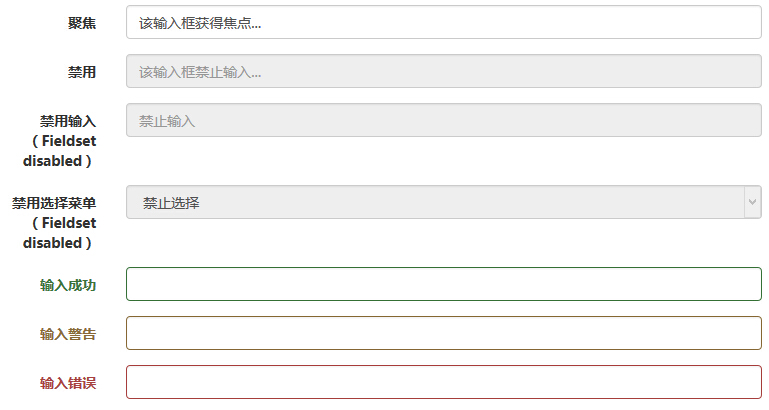
表單控件狀態
除了 :focus 狀態(即,用戶點擊 input 或使用 tab 鍵聚焦到 input 上),Bootstrap 還為禁用的輸入框定義了樣式,并提供了表單驗證的 class。
輸入框焦點
當輸入框 input 接收到 :focus 時,輸入框的輪廓會被移除,同時應用 box-shadow。
禁用的輸入框 input
如果您想要禁用一個輸入框 input,只需要簡單地添加 disabled 屬性,這不僅會禁用輸入框,還會改變輸入框的樣式以及當鼠標的指針懸停在元素上時鼠標指針的樣式。
禁用的字段集 fieldset
對 <fieldset> 添加 disabled 屬性來禁用 <fieldset> 內的所有控件。
驗證狀態
Bootstrap 包含了錯誤、警告和成功消息的驗證樣式。只需要對父元素簡單地添加適當的 class(.has-warning、 .has-error 或 .has-success)即可使用驗證狀態。
下面的實例演示了所有控件狀態:
<!DOCTYPE html>
<html>
<head>
   <title>Bootstrap 實例 - 表單控件狀態</title>
   <link href="/bootstrap/css/bootstrap.min.css" rel="stylesheet">
   <script src="/scripts/jquery.min.js"></script>
   <script src="/bootstrap/js/bootstrap.min.js"></script>
</head>
<body>

<form class="form-horizontal" role="form">
   <div class="form-group">
      <label class="col-sm-2 control-label">聚焦</label>
      <div class="col-sm-10">
         <input class="form-control" id="focusedInput" type="text"
            value="該輸入框獲得焦點...">
      </div>
   </div>
   <div class="form-group">
      <label for="inputPassword" class="col-sm-2 control-label">
         禁用
      </label>
      <div class="col-sm-10">
         <input class="form-control" id="disabledInput" type="text"
            placeholder="該輸入框禁止輸入..." disabled>
      </div>
   </div>
   <fieldset disabled>
      <div class="form-group">
         <label for="disabledTextInput"  class="col-sm-2 control-label">
            禁用輸入(Fieldset disabled)
         </label>
         <div class="col-sm-10">
            <input type="text" id="disabledTextInput" class="form-control"
               placeholder="禁止輸入">
         </div>
      </div>
      <div class="form-group">
         <label for="disabledSelect"  class="col-sm-2 control-label">
            禁用選擇菜單(Fieldset disabled)
         </label>
         <div class="col-sm-10">
            <select id="disabledSelect" class="form-control">
               <option>禁止選擇</option>
            </select>
         </div>
      </div>
   </fieldset>
   <div class="form-group has-success">
      <label class="col-sm-2 control-label" for="inputSuccess">
         輸入成功
      </label>
      <div class="col-sm-10">
         <input type="text" class="form-control" id="inputSuccess">
      </div>
   </div>
   <div class="form-group has-warning">
      <label class="col-sm-2 control-label" for="inputWarning">
         輸入警告
      </label>
      <div class="col-sm-10">
         <input type="text" class="form-control" id="inputWarning">
      </div>
   </div>
   <div class="form-group has-error">
      <label class="col-sm-2 control-label" for="inputError">
         輸入錯誤
      </label>
      <div class="col-sm-10">
         <input type="text" class="form-control" id="inputError">
      </div>
   </div>
</form>

</body>
</html>
結果如下所示:
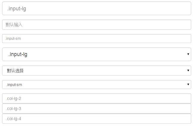
表單控件大小
您可以分別使用 class .input-lg 和 .col-lg-* 來設置表單的高度和寬度。下面的實例演示了這點:
<!DOCTYPE html>
<html>
<head>
   <title>Bootstrap 實例 - 表單控件大小</title>
   <link href="/bootstrap/css/bootstrap.min.css" rel="stylesheet">
   <script src="/scripts/jquery.min.js"></script>
   <script src="/bootstrap/js/bootstrap.min.js"></script>
</head>
<body>

<form role="form">
   <div class="form-group">
      <input class="form-control input-lg" type="text"
         placeholder=".input-lg">
   </div>

   <div class="form-group">
      <input class="form-control" type="text" placeholder="默認輸入">
   </div>

   <div class="form-group">
      <input class="form-control input-sm" type="text"
         placeholder=".input-sm">
   </div>
   <div class="form-group">
   </div>
   <div class="form-group">
      <select class="form-control input-lg">
         <option value="">.input-lg</option>
      </select>
   </div>
   <div class="form-group">
      <select class="form-control">
         <option value="">默認選擇</option>
      </select>
   </div>
   <div class="form-group">
      <select class="form-control input-sm">
         <option value="">.input-sm</option>
      </select>
   </div>

   <div class="row">
      <div class="col-lg-2">
         <input type="text" class="form-control" placeholder=".col-lg-2">
      </div>
      <div class="col-lg-3">
         <input type="text" class="form-control" placeholder=".col-lg-3">
      </div>
      <div class="col-lg-4">
         <input type="text" class="form-control" placeholder=".col-lg-4">
      </div>
   </div>
</form>

</body>
</html>
結果如下所示:
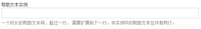
表單幫助文本
Bootstrap 表單控件可以在輸入框 input 上有一個塊級幫助文本。為了添加一個占用整個寬度的內容塊,請在 <input> 后使用 .help-block。下面的實例演示了這點:
<!DOCTYPE html>
<html>
<head>
   <title>Bootstrap 實例 - 表單幫助文本</title>
   <link href="/bootstrap/css/bootstrap.min.css" rel="stylesheet">
   <script src="/scripts/jquery.min.js"></script>
   <script src="/bootstrap/js/bootstrap.min.js"></script>
</head>
<body>

<form role="form">
   <span>幫助文本實例</span>
   <input class="form-control" type="text" placeholder="">
   <span class="help-block">一個較長的幫助文本塊,超過一行,
   需要擴展到下一行。本實例中的幫助文本總共有兩行。</span>
</form>

</body>
</html>
結果如下所示: