本文介紹了Css3新特性應(yīng)用之視覺(jué)效果,具體有單側(cè)陰影、不規(guī)則投影、染色體效果、毛玻璃效果、折角效果,具體實(shí)現(xiàn)如下:
一、單側(cè)陰影
1、box-shadow屬性的應(yīng)用,格式:h-shadow v-shadow blur spread color inset屬性取值介紹 h-sahdow:水平陰影的位置,允許負(fù)值
①v-shadow:垂直陰影的位置,允許負(fù)值
②blur:模糊距離
③spread:陰影的尺寸,擴(kuò)張距離,可以為負(fù)數(shù)
④color:陰影的顏色
⑤inset/outset:內(nèi)部或者外部陰影
2、陰影的擴(kuò)張距離對(duì)四邊都有效,不能單獨(dú)應(yīng)用于單邊。
3、box-shadow支持多組值同時(shí)生效的設(shè)置
示例代碼:
.wrap{
            width: 200px;
            height: 120px;
            background: yellowgreen;
            box-shadow: 2px 0px 4px -2px black,
                        -2px 0px 4px -2px black;
        }

二 、不規(guī)則投影
1、利用border-radius生成的形狀,用投影很好,但是如果加入了偽元素和半透明的裝飾,陰影表現(xiàn)就很不好了,如下情況都會(huì)有問(wèn)題。
① 半透明圖像、背景圖像、或者border-image
②元素設(shè)置了點(diǎn)狀、虛線或半透明的邊框,但沒(méi)有背景(或者background-clip不是border-box時(shí))
③元素內(nèi)部有小角是用偽元素生成
④通過(guò)clip-path生成的形狀
解決辦法:利用svg的drop-shadow來(lái)實(shí)現(xiàn)
示例代碼:
.wrap{
            width: 200px;
            height: 120px;
            border: 6px dotted yellowgreen;
            --box-shadow: 0px 0px 4px 0px black;
            -webkit-filter: drop-shadow(2px 0px 2px rgba(0,0,0,1))
        }

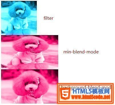
三、染色體效果
1、基于濾鏡實(shí)現(xiàn),應(yīng)用filter屬性的相關(guān)值,調(diào)整圖片的飽合度、亮度等值
2、基于min-blend-mode實(shí)現(xiàn),作用:實(shí)現(xiàn)元素內(nèi)容與背景以及下面的元素發(fā)生“混合”
3、基本background-blend-mode實(shí)現(xiàn),作用:實(shí)現(xiàn)背景顏色與背景圖片、背景圖片與圖片的混合
三種情況的示例代碼:
.wrap1{
            width: 200px;
            height: 120px;
            overflow: hidden;
        }
        .wrap1 > img{
            max-height: 100%;
            max-width: 100%;
            -webkit-filter: sepia(1) saturate(4) hue-rotate(150deg);
        }

        .wrap2{
            width: 200px;
            height: 120px;
            background: hsl(335, 100%, 50%);
            overflow: hidden;
        }
        .wrap2 > img{
            height: 100%;
            width: 100%;
            mix-blend-mode: luminosity;
        }

        .wrap3{
            width: 200px;
            height: 120px;
            background-size: cover;
            background-color: hsl(335, 100%, 50%);
            background-image: url("../img/cat.png");
            background-blend-mode: luminosity;
        }
四、毛玻璃效果
主要實(shí)現(xiàn)原理:內(nèi)容偽元素背景與底層背景相同的圖片;并加上filter:blur模糊濾鏡即可。注意blur不能應(yīng)用在底層背景,也不能應(yīng)用在元素的背景上(這樣會(huì)地元素本身應(yīng)用blur模糊,會(huì)導(dǎo)致文本看不見(jiàn)),只能就用在偽元素上。
代碼如下:
body{
    background: url("../img/cat.png") no-repeat;
    background-size: cover;
}
.wrap{
    position: relative;
    width: 500px;
    margin: 0px auto;
    padding: 10px;
    line-height: 1.5;
    background: hsla(0, 0%, 100%, .3);
    overflow: hidden;
}
.wrap::before{
    content: '';
    background: url("../img/cat.png") 0/cover fixed;
    position: absolute;
    top: 0; right: 0; bottom: 0; left: 0;
    filter: blur(20px);
    z-index: -1;
    margin: -30px;
}
代碼說(shuō)明:1、body與wrap偽元素都應(yīng)用相同的背景圖片
2、wrap的background-attachment設(shè)置為fixed,讓背景圖不要跟隨滾動(dòng)一起動(dòng)
3、wrap偽元素設(shè)置為絕對(duì)定位,且z-index層級(jí)只高于背景
4、利用blur設(shè)定wrap偽元素的模糊尺寸
5、用margin負(fù)值增加寬度,父元素用overflow:hidden隱藏溢出,讓模糊背景更加真實(shí)。
五、折角效果
實(shí)現(xiàn)步驟
1、首先利用linear-gradient實(shí)現(xiàn)切角效果2、然后再利用linear-gradinet生成一個(gè)三角形,并設(shè)置他的位置與寬高